Branding guide
Real Estate Branding: A Practical Guide for Agencies & Agents
Buyers and sellers choose an agent long before they make a call. Your brand is what they judge you on. This guide covers the essentials of real estate branding — from logo and colors to a social media system that keeps listings consistent — using my work for Tyson Realty as a worked example.
By Abdulrahman Mohammed, Brand & UI/UX Designer at RedXGraphixs
Why real estate branding matters
Real estate is a high-value, high-trust decision. Most agencies sell similar properties in the same areas, so the brand becomes the real differentiator. A clear brand helps you:
- Earn trust faster — a consistent, professional look signals reliability.
- Stand out in a crowded feed — listings look alike; your presentation shouldn't.
- Attract the right clients — luxury, first-time buyers and investors respond to different cues.
- Scale your marketing — a system of templates means every new listing looks on-brand.
Brand foundations: trust, luxury, community
Before designing anything, decide which of these three values leads your brand:
- Trust — clarity, honesty and expertise. Clean layouts, plain language, real photos of your team.
- Luxury — restraint and space. Generous whitespace, refined type, fewer but better images.
- Community — warmth and local knowledge. Neighborhood stories, friendly tone, people over buildings.
Write one sentence that describes who you serve and why they should pick you. Every design choice should support it.
Logo design for real estate
Rooftops, keys and house outlines are everywhere — they rarely make an agency memorable. Aim for:
- Simplicity — it must read on a yard sign, a phone screen and a business card.
- A distinctive wordmark or monogram — your name is your asset; make it ownable.
- Versatility — light and dark versions, a compact icon for social avatars and watermarks.
- Longevity — avoid trendy effects that will date the brand in two years.
Color psychology in real estate
Color sets expectations before anyone reads a word. Common associations:
- Navy and blue — trust, stability, professionalism. The safest choice for most agencies.
- Black, charcoal, gold — luxury and exclusivity; ideal for premium listings.
- Green — growth, nature, sustainability; suits suburban or eco-focused brands.
- Warm oranges and reds — energy and approachability; use as accents for calls to action.
Keep the palette tight: one primary, one neutral, one accent. Consistency matters more than the exact hue.
Typography and photography
Pair one confident heading font with one highly readable body font. Prices, addresses and bedroom counts should be instantly scannable. Photography is half your brand: agree on a consistent style (light, angles, editing) so every listing feels like it came from the same agency.
Social media strategy for agents
Social is where most people meet your brand first. A simple, repeatable system beats sporadic posting:
- Listing posts — a fixed template: hero photo, price, key features, one clear next step.
- Carousels — walk through a property room by room, or explain the buying process.
- Testimonials — branded quote graphics from real clients build social proof.
- Stories — open houses, behind the scenes, "just sold" updates.
- Education — tips for buyers and sellers position you as the expert.
Build these as reusable templates so your team can post new listings without breaking the look.
Case study: Tyson Realty
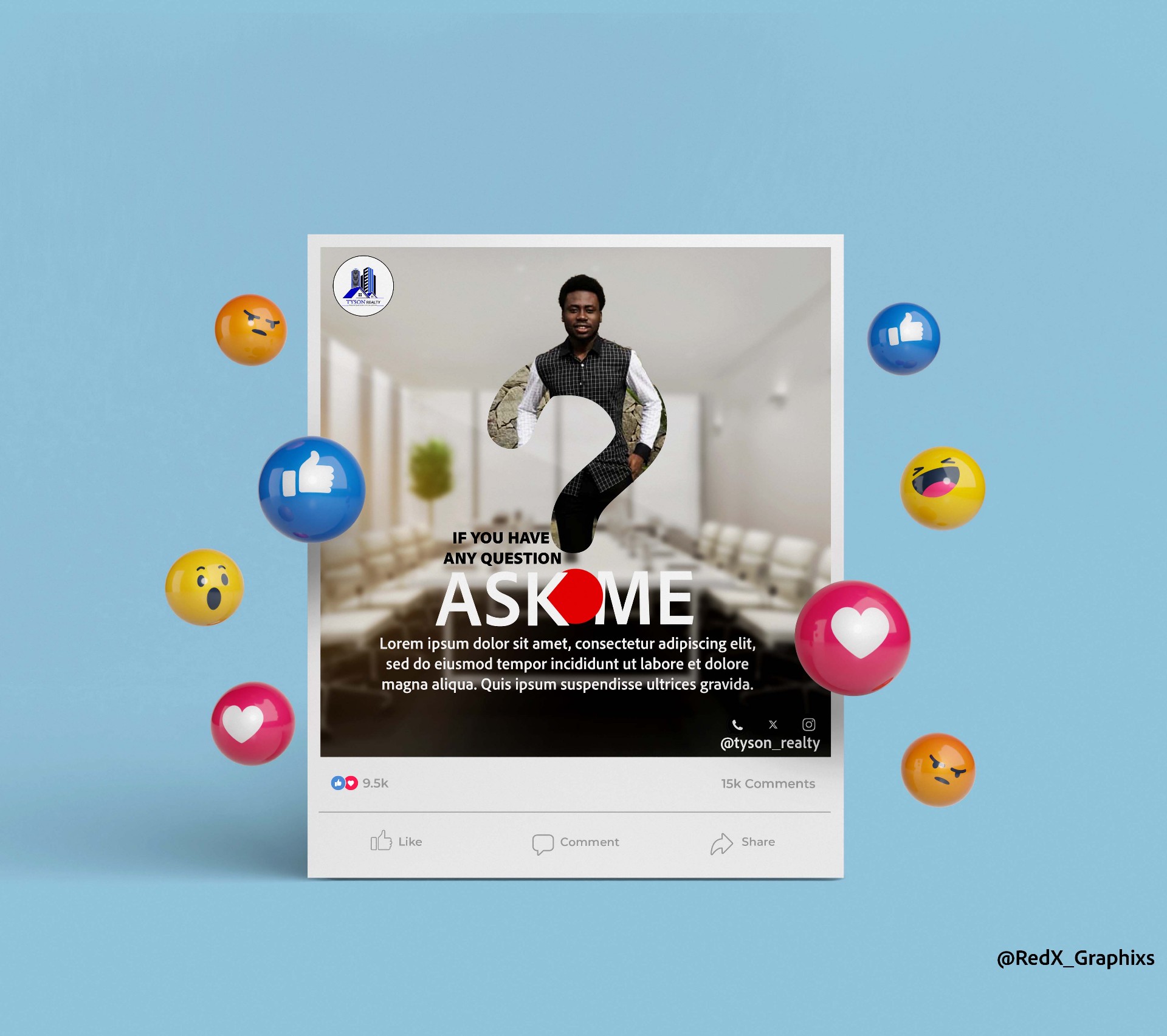
Tyson Realty needed a consistent visual voice across Instagram and Facebook — one that reinforced credibility and helped properties stand out. The approach applied the principles above:
- Trust-led palette — a confident dark-and-blue system with clean typography.
- Clarity-first messaging — each post answers who the property is for, what makes it special, and what to do next.
- Modular templates — listing posts, carousels, testimonial graphics, story templates and Facebook ad creatives.
- A reusable kit — so the in-house team can add new weekly listings while staying on-brand.
The result was a library of 50+ social assets and a reported 120% increase in engagement. See the full Tyson Realty case study.
Real estate branding checklist
- One-sentence positioning: who you serve and why you.
- Lead value chosen: trust, luxury or community.
- Simple, versatile logo with light/dark and icon versions.
- Tight palette: primary, neutral, accent.
- Two fonts, consistent photo style.
- Social templates for listings, carousels, testimonials and stories.
- A short brand guide so your team stays consistent.
Need a real estate brand that sells?
I design brand identities and social media systems for agencies and agents.